
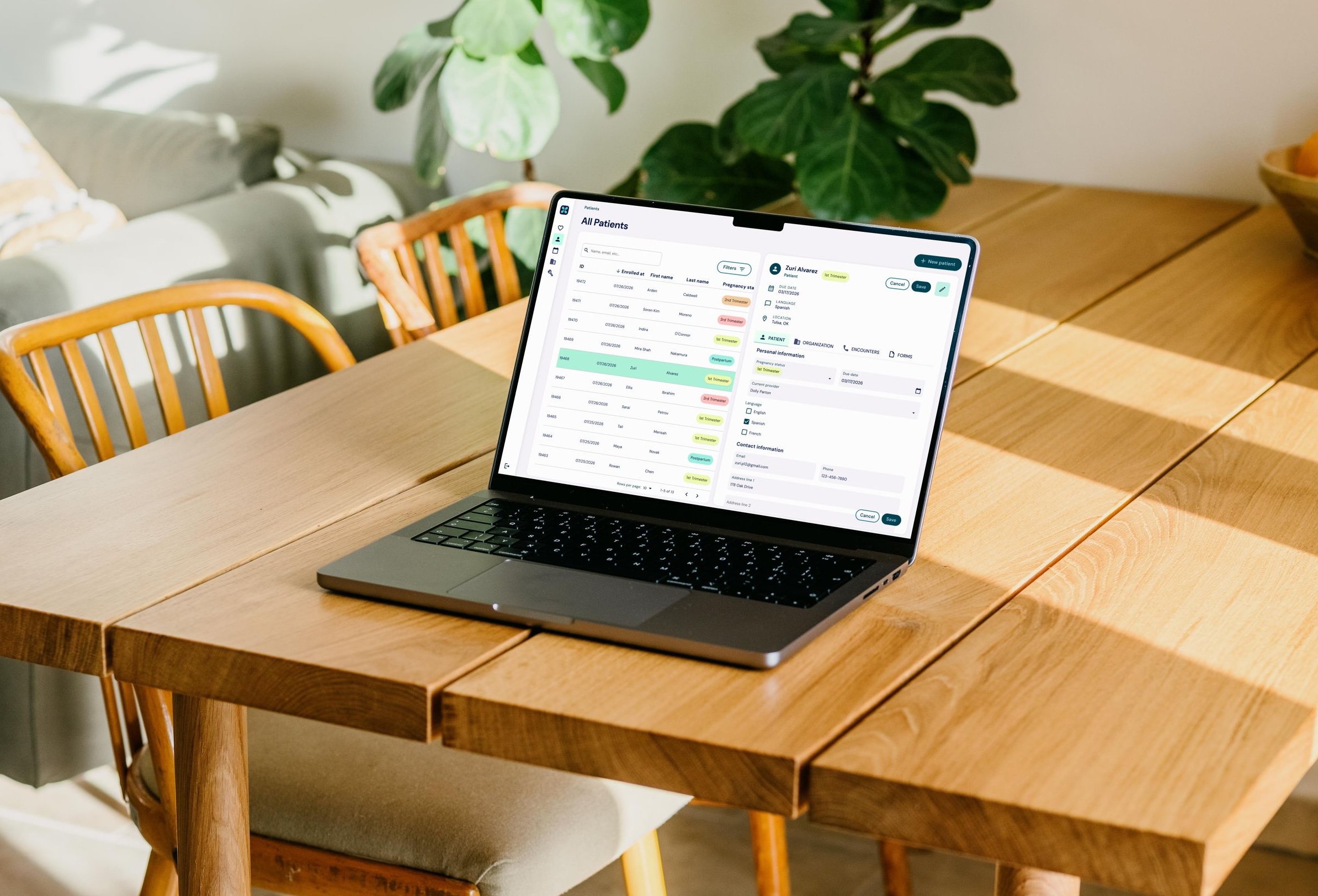
the discovery
interviews
The product team took an initial stab at brainstorming the key user stories that applied to our product suite. We identified where there were gaps between needs and functionality across the business.
Then we sat down with our internal teams to get a better understanding of how they currently used the admin panel, how they would like to use the admin panel, and what was missing from that experience. We added to our user stories as we gained a better understanding of what their day-to-day operations looked like.
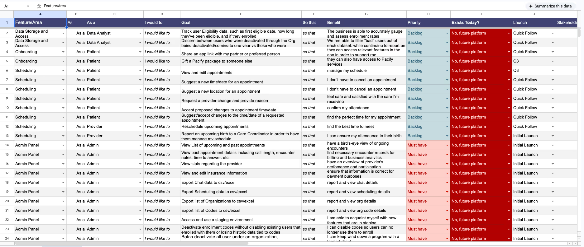
the requirements
1. clinical
- Monitor clinical interactions & provider availability
- Approve & lock provider charts
- Manage credentialing
2. client success & billing
- Disable or set a term date for partnerships
- View & change billing information
- Monitor enrollments & eligibility
3. providers
- Manage availability & personal information
- Escalate encounters for clinical review
- See & sell care packages
new data
In early 2025 we integrated Healthie, an EHR, to handle clinical records and billing. It solved a real need, but it split our backend across two systems that didn't talk to each other. The only thing tying them together was fragile, incomplete mapping in the code. The panel had no knowledge of whole categories of that data, and couldn't see appointments at all. Much of what the business ran on didn't live in either system yet. It sat in spreadsheets the clinical team maintained by hand.
Three buckets of data needed to come together in one interface:
Healthie
- Care plans (credits per appointment type allotted to each organization)
- Credits
- Appointments
- Provider availability
Disparate spreadsheets
- Matching providers to patients
- Provider certifications
- Patient preferences
- Organizational requirements (term dates, contract stipulations, etc.)
Admin panel
- Organizations
- Enrollment codes
- Provider roles
My job was to see how all of this connected and to anticipate where each piece needed to surface, so one interface could hold data that had never lived together before.
the obstacles
unclear ownership
Functionality across Pacify's product suite was controlled by a single roles table with almost 500 entries; everything was packed into one JSON attributes field that mixed several unrelated things:
- User and provider types like patient, nurse, and doula
- Internal permission levels like clinical, operations, and care coordinator
- Features like lactation on-demand video and doula chat
- Organization-specific custom lines like a health plan's own 24/7 nurse hotline
Because all of it shared one table, the same value could mean different things depending on context. It was hard to read, risky to change, and easy to get wrong.
time-consuming troubleshooting
Troubleshooting a single permissions bug for our non-tech colleagues meant touring the whole platform:
- Find the org on the Organizations page and check its roles
- Go to Patients and search for the person
- Open their details to find the enrollment code they used
- Go to Enrollment Codes and filter by org
- Open that specific code to check its roles
- Open a separate browser to check the patient's credit balance in Healthie, the EHR
Six stops across five pages and a second system to answer one question about one person.
data with no home
Underneath both of those sat a bigger problem. The panel could only show data it was explicitly built to read, so the team had to jump back and forth from Healthie, the admin panel, and disparate spreadsheets that they created to manage operations. Provider capacity, credentials and their expiration dates, care-plan credits, appointment details, patient preferences, and the contractual terms for each organization had no reliable home in the interface.
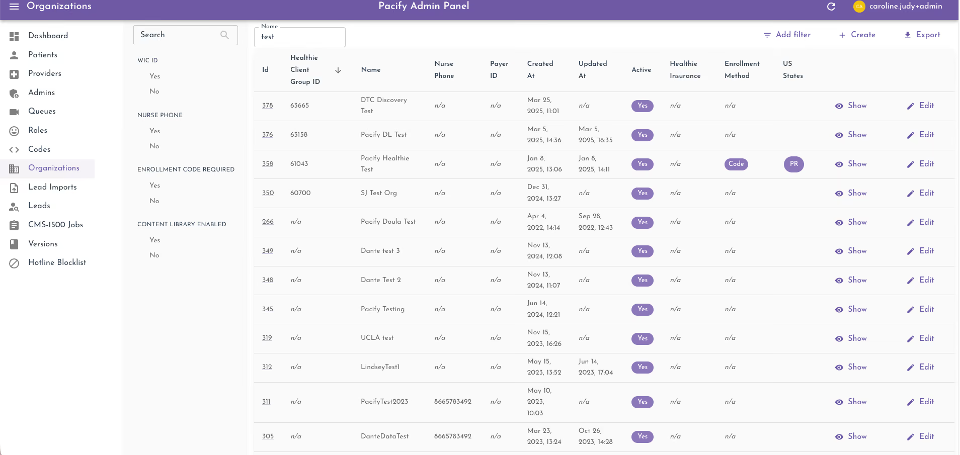
what they had in common
All problems came from the same root. The admin panel's interface was relatively agnostic to the connections within the underlying data architecture. It was a set of static screens built from specific data points, so anything the business added meant another screen, another place to look, and another chance for the data to fall out of sync.
the process
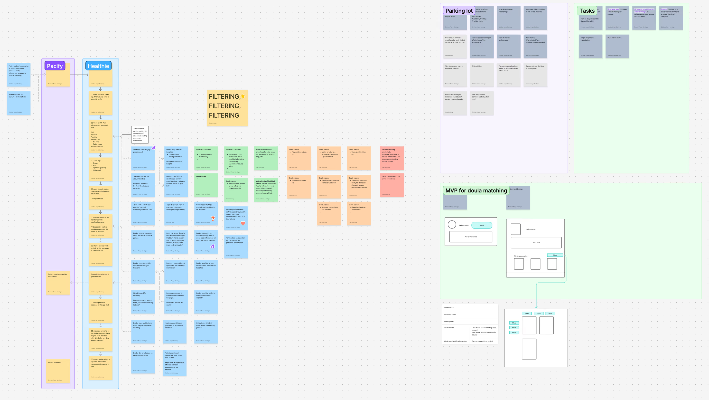
data-to-UI mapping
Working with the senior data analyst, we defined which existing and new data points the new flows required, and mapped where & how each data point connected with others and surfaced in the database. The data team owned the database and the dev team built the APIs that wired it to the front end. My part was the layer in between: deciding what data a view needs and how a person reads it.
Based on the interviews, data mapping, and existing functionality, I defined the platform's core structure for admins & providers.
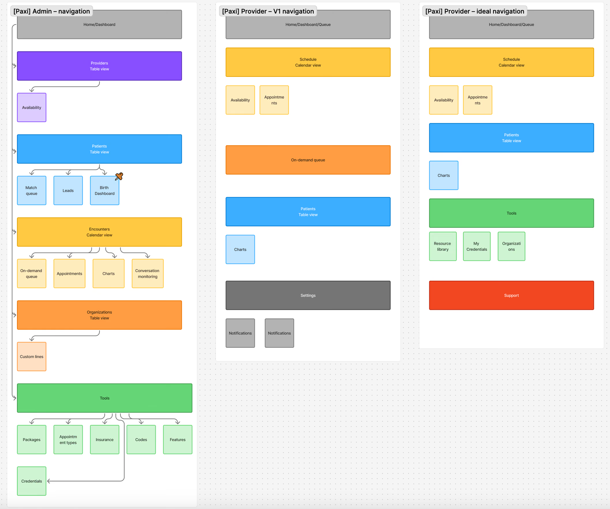
mapping the connections
The hard part wasn't listing data points, it was the relationships between them.
I mapped where each data point lived, what it connected to, and where it needed to surface, so a single view could pull from Healthie, the database, and the old spreadsheet data at once and still read as one coherent screen.
splitting the roles table
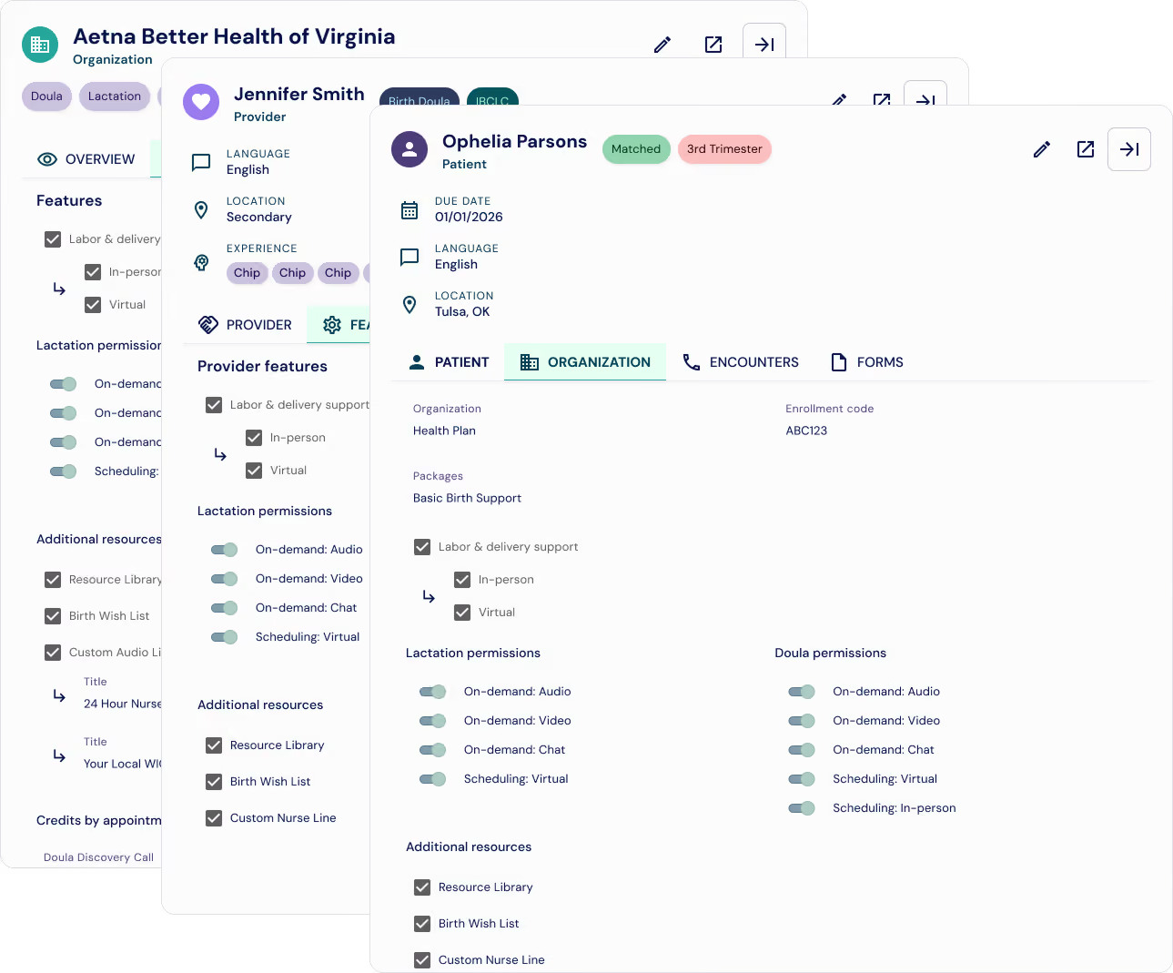
I split the single roles table into clear categories: custom lines, user permissions, and features. Each became its own concept with its own home, so a value means one thing only. For V1 the underlying data stayed the same in the database, so nothing broke downstream. The layer on top became more logical, easier to manage, and more accessible to the teams using it.
A modular "features" tab allowed us to re-use the exact same formatting for patient, organization, and code-level displays. All uniform
collapsing the fix into one side sheet
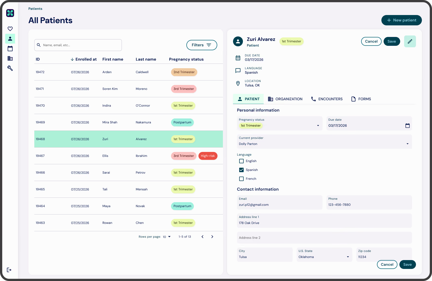
Everything that used to take six stops now opens in one side sheet on the patient.
A user's enabled features, organization/insurance information, permissions, credits, appointments, charts, etc. all pulled from Healthie, the database, and what used to be spreadsheets, into one view.
the build
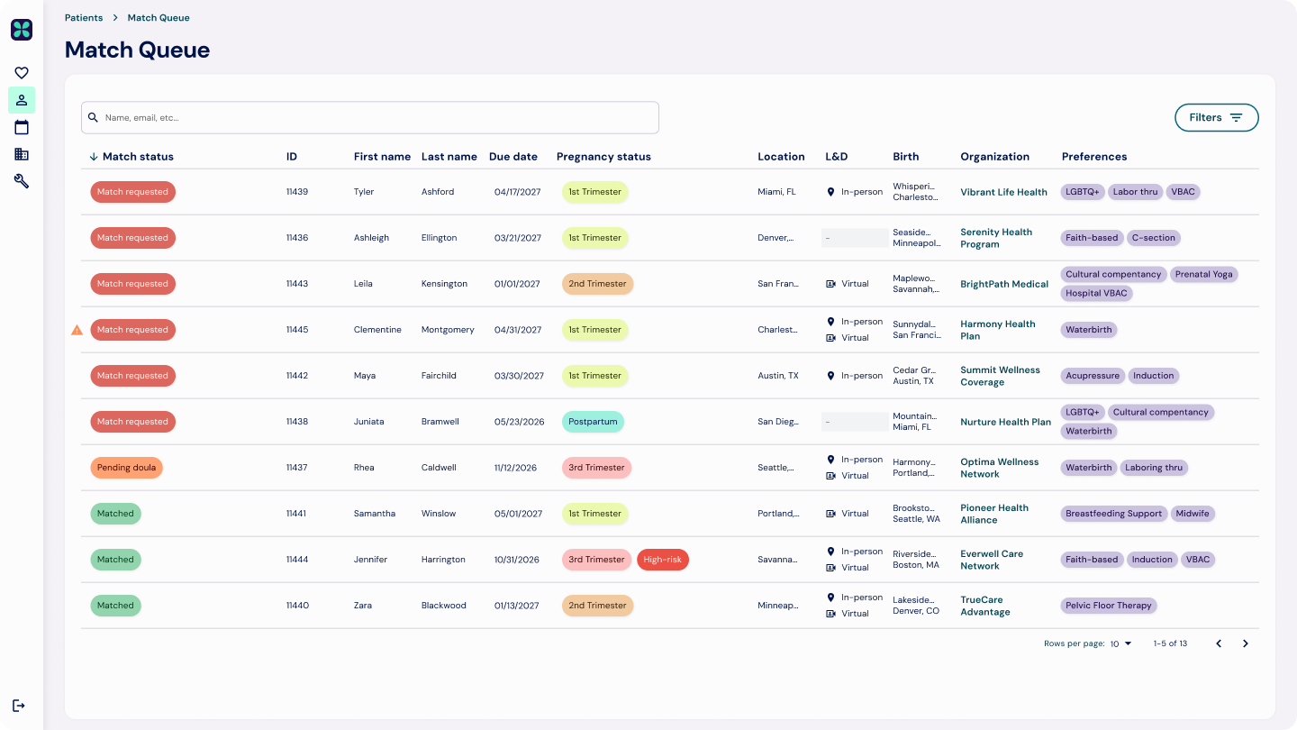
building the match queue from scratch
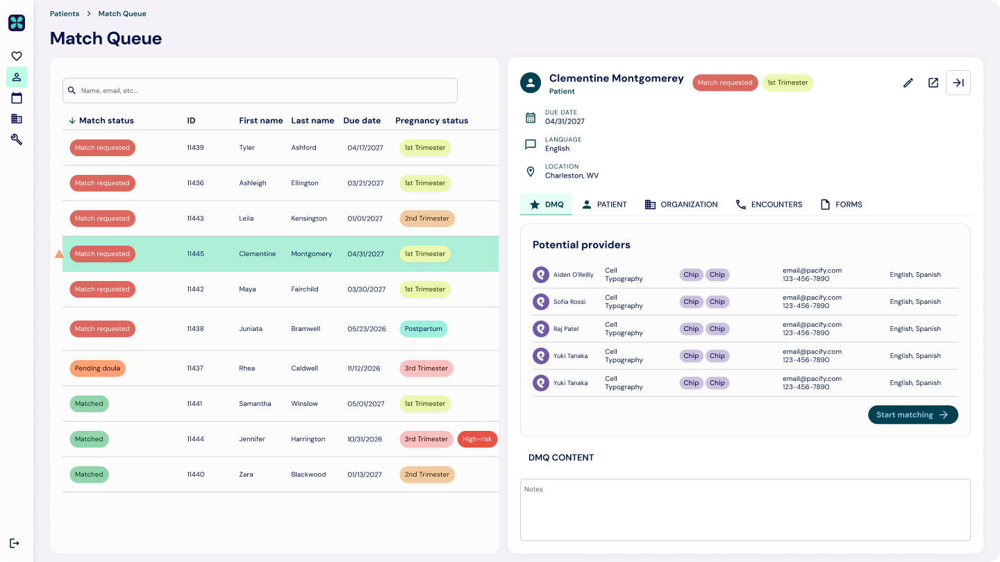
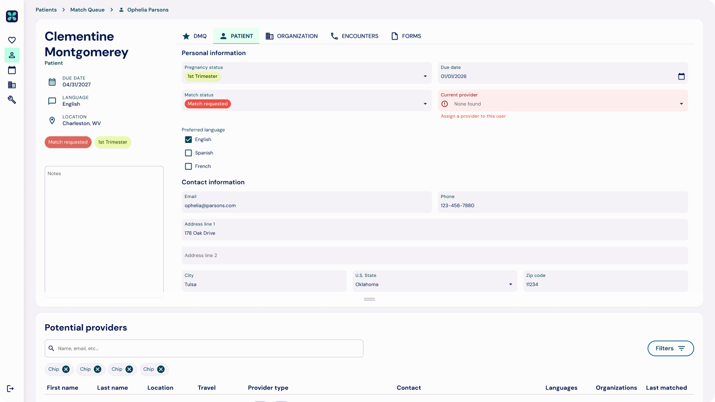
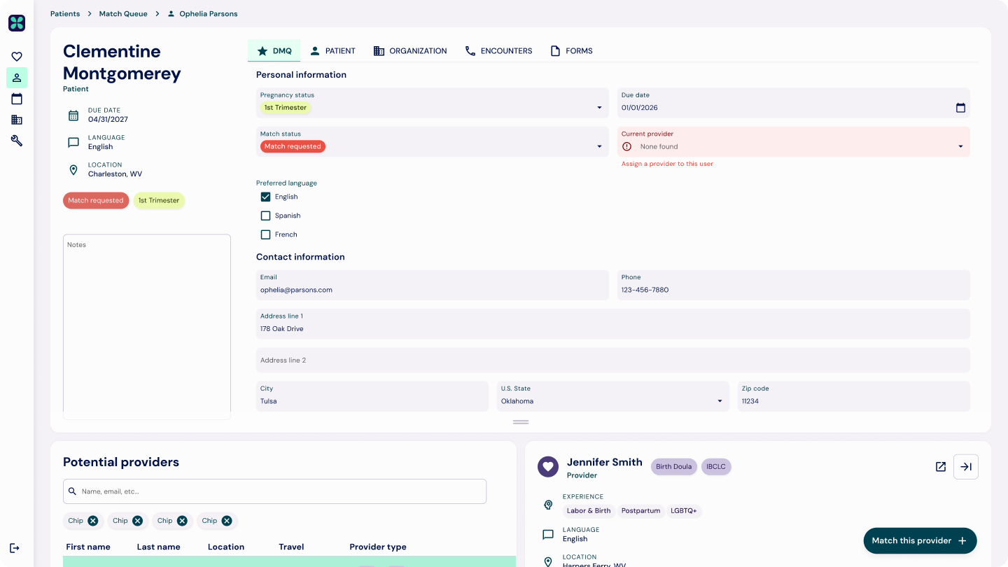
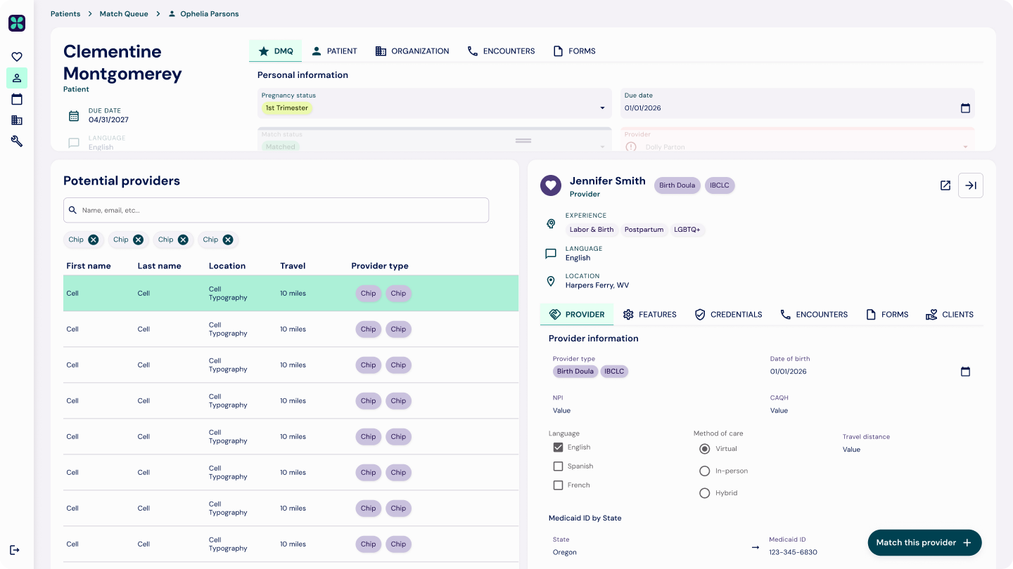
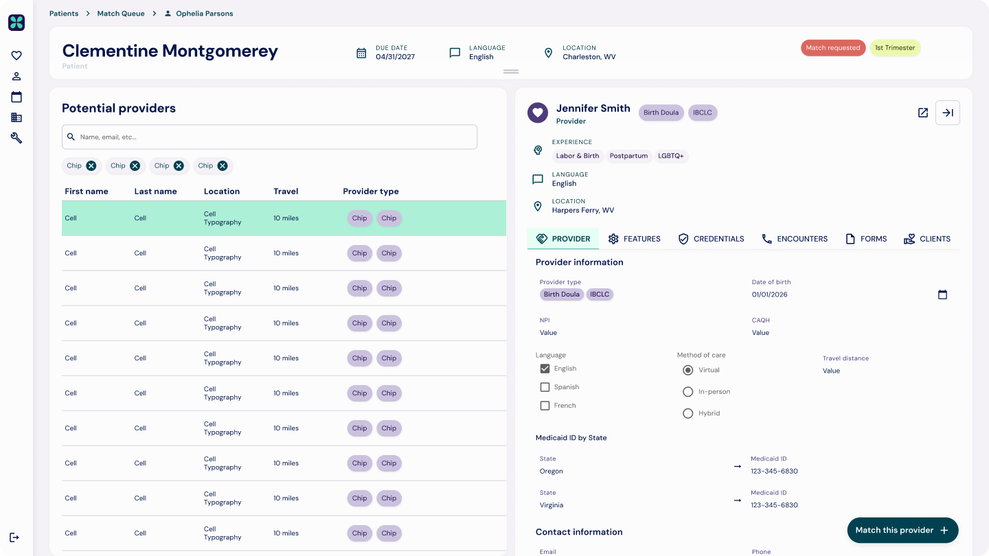
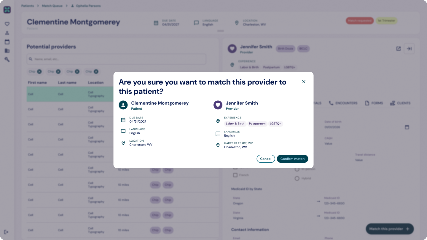
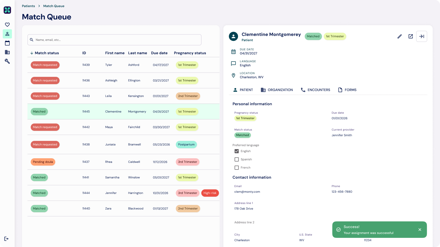
Matching a patient to a doula was the operation's core loop, but the old panel had no home for it. This was a net-new experience, built for the doula and care team so they could see where a patient sits in their doula journey and care plan. Part of what made it new: a lot of the data it needed lived only in Healthie and never appeared in the admin panel. Credit balances are the clearest example. I designed a queue that shows every incoming request at a glance with its status, and a detail view that surfaces a pre-filtered list of eligible doulas by tags, location, credential, and monthly capacity.
role-based by design
Because every view reads from the same components, permissions stay consistent across the platform. Clinical, care coordination, and customer success each see and do what they're responsible for, and nothing they aren't.
a design system that scales with the data
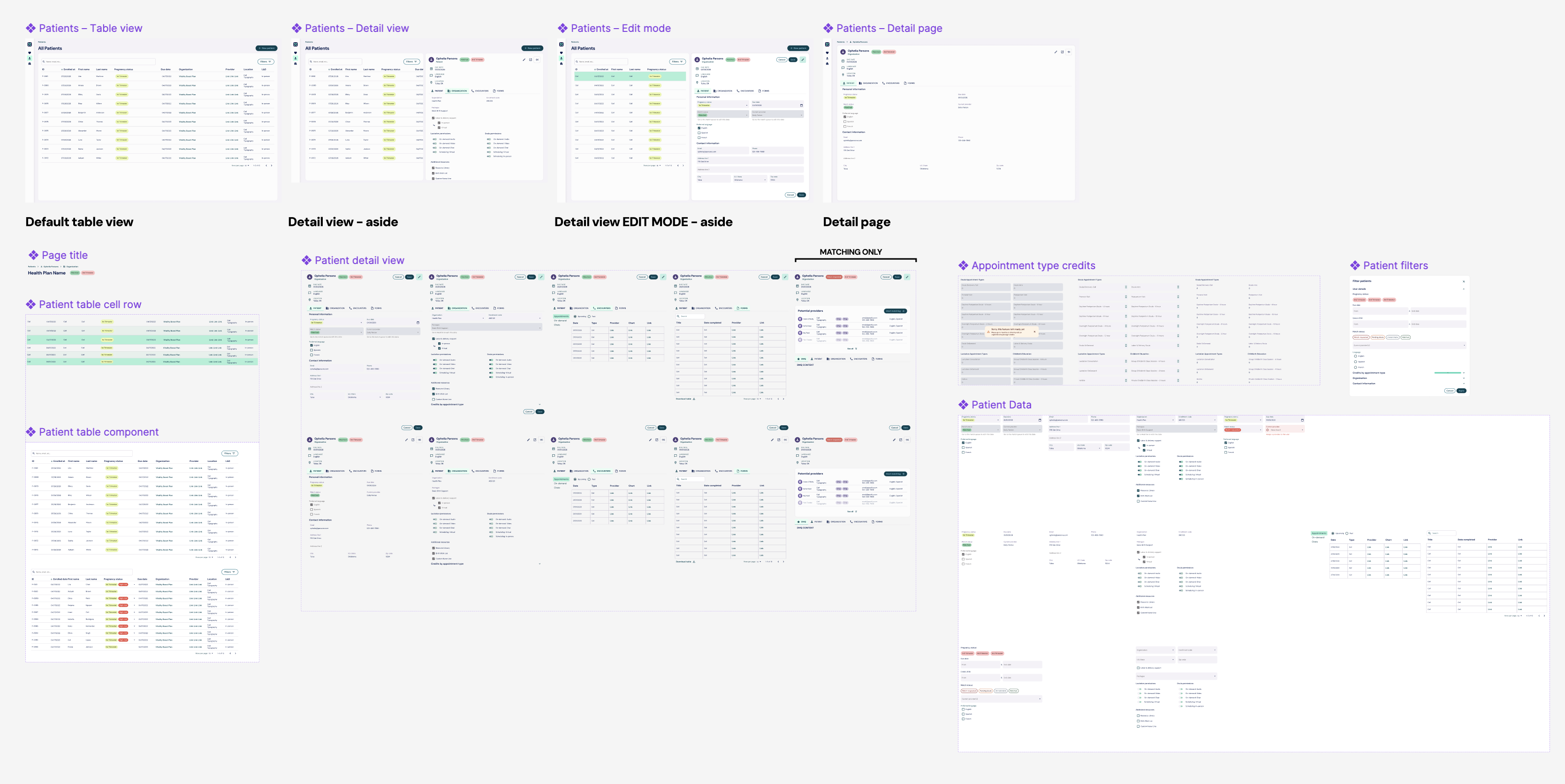
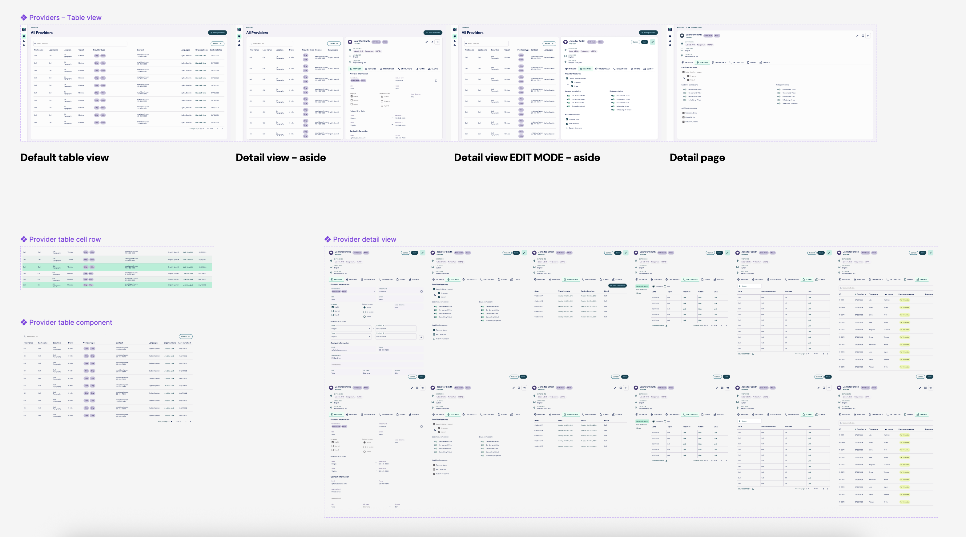
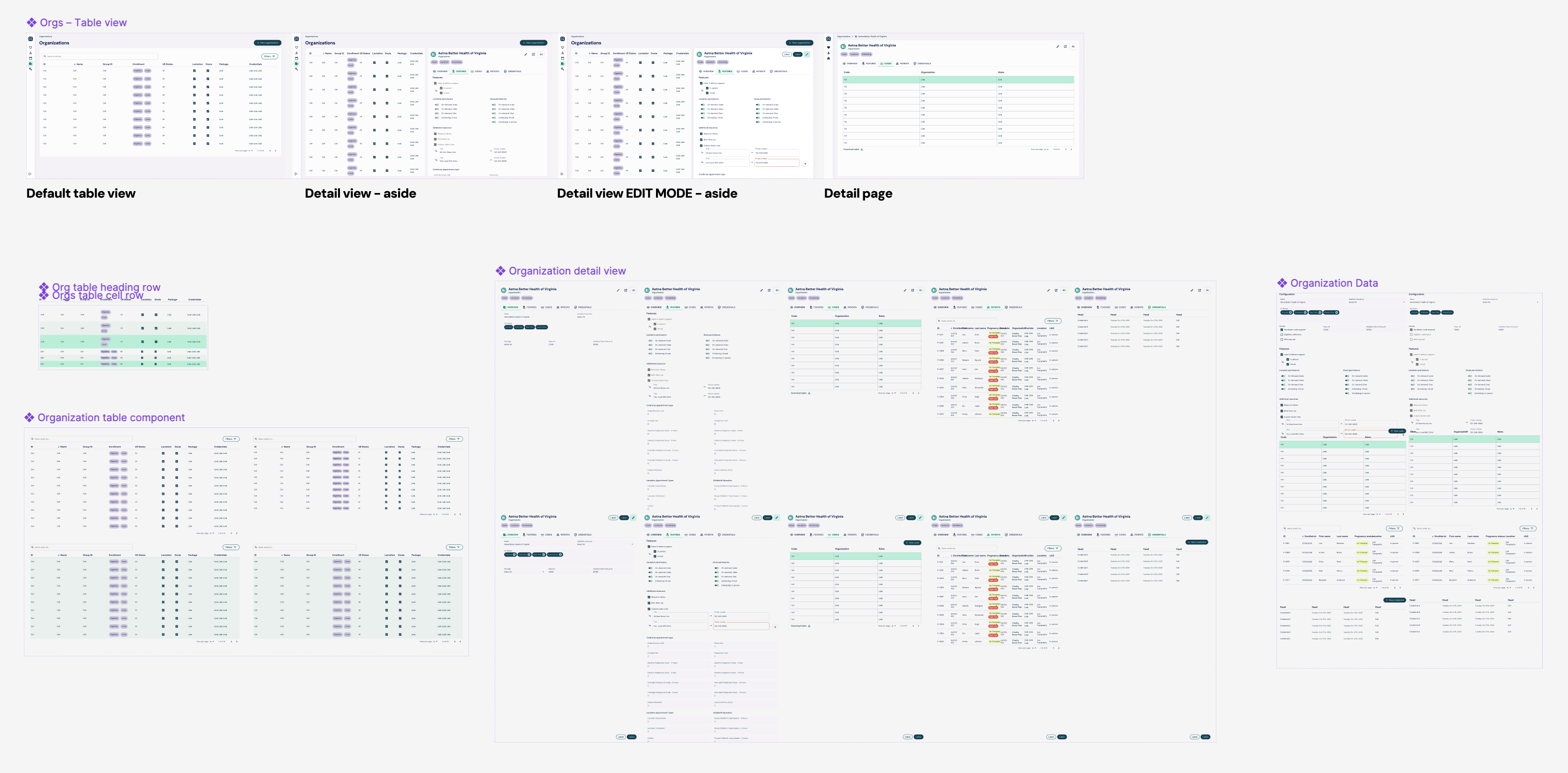
None of this holds together without a consistent component layer. I built one atomic design system so the same data reads the same way everywhere, new data can appear without a one-off screen, and role-based permissions are respected view to view. It was structured as atoms, molecules, and organisms on shadcn/ui, and matured across versions from v0.1 to v0.4.
# Component Specification Template

## Basic Information
**Component Name:** [Name]
**Atomic Level:** [ ] Atom  [ ] Molecule  [ ] Organism
**Version:** [1.0]
**Last Updated:** [Date]
**Designer:** [Your Name]

---

## Component Overview
**Purpose:**
[Brief description of what this component does and why it exists]

**Design File Location:**
[Link to Figma file]

---

## Composition & Relationships

### Parent Components
[List components this element is used within, or note "None - standalone component"]

### Child Components
[List all atomic elements this component is composed of]
- Component Name (Atomic Level) - Usage notes
- Example: Button (Atom) - Used for primary CTA
- Example: Icon (Atom) - Leading icon, optional

### Dependencies
[Any external libraries, systems, or components required]
- Design tokens/variables
- Icon libraries
- Third-party packages

---

## Visual Specifications

### Layout & Spacing
- **Dimensions:** [Width × Height, or constraints]
- **Padding:** [Top, Right, Bottom, Left]
- **Margin:** [Top, Right, Bottom, Left]
- **Gap/Spacing:** [Between child elements]
- **Border Radius:** [Value]
- **Border:** [Width, Style, Color]

### Typography
- **Font Family:** [Font name]
- **Font Size:** [Size in px/rem]
- **Font Weight:** [Weight]
- **Line Height:** [Value]
- **Letter Spacing:** [Value]
- **Text Alignment:** [Left/Center/Right]
- **Text Transform:** [None/Uppercase/Capitalize]

### Colors
- **Background:** [Color value + token name]
- **Foreground/Text:** [Color value + token name]
- **Border:** [Color value + token name]
- **Additional colors:** [Any other colors used]

### Shadows & Effects
- **Box Shadow:** [Shadow specifications]
- **Opacity:** [If applicable]
- **Blend Mode:** [If applicable]
- **Backdrop Filter:** [If applicable]

---

## Variants & States

### Variants
[List all design variants]
1. **[Variant Name]**
   - Use case: [When to use]
   - Visual differences: [What changes]

### States
[Document all interactive states]
- [ ] **Default** - [Description]
- [ ] **Hover** - [What changes on hover]
- [ ] **Active/Pressed** - [What changes when clicked]
- [ ] **Focus** - [Keyboard focus appearance]
- [ ] **Disabled** - [Appearance and behavior]
- [ ] **Loading** - [If applicable]
- [ ] **Error** - [If applicable]
- [ ] **Success** - [If applicable]

---

## Interactive Behavior

### User Interactions
**Triggers:**
- [Click/Tap/Hover/Keyboard/etc.]

**Actions:**
- [What happens when user interacts]

**Transitions & Animations:**
- **Property:** [What animates]
- **Duration:** [Time in ms]
- **Easing:** [Easing function]
- **Trigger:** [What initiates animation]

### Responsive Behavior
**Breakpoints:**
- **Mobile (< 768px):** [How component adapts]
- **Tablet (768px - 1024px):** [How component adapts]
- **Desktop (> 1024px):** [How component adapts]

**Adaptive Rules:**
- [How component scales, reflows, or changes]

---

## Properties & Props

### Required Props
| Prop Name | Type | Description | Example |
|-----------|------|-------------|---------|
| [name] | [string/number/bool/etc] | [What it controls] | "value" |

### Optional Props
| Prop Name | Type | Default | Description | Example |
|-----------|------|---------|-------------|---------|
| [name] | [type] | [default] | [What it controls] | value |

### Slots/Children
[If component accepts children/content]
- **[Slot name]:** [Description of what goes here]

---

## Content Guidelines

### Text Content
- **Character Limits:** [Min/Max characters or "flexible"]
- **Recommended Length:** [Ideal length]
- **Line Clamping:** [If text should truncate]
- **Overflow Behavior:** [Ellipsis/wrap/scroll]

### Image/Media Guidelines
- **Aspect Ratio:** [Ratio or dimensions]
- **Supported Formats:** [jpg, png, svg, etc.]
- **Optimal Size:** [Dimensions and file size]
- **Alt Text:** [Required/Optional]

### Iconography
- **Icon Set:** [Which icon library]
- **Size:** [Dimensions]
- **Placement:** [Where icons appear]
- **Color:** [Icon color specifications]

---

## Accessibility Requirements

### Semantic HTML
**Recommended Element:** [e.g., button, nav, input]
**ARIA Role:** [If different from semantic element]

### ARIA Attributes
- aria-label: [When to use]
- aria-labelledby: [When to use]
- aria-describedby: [When to use]
- aria-expanded: [For interactive elements]
- aria-disabled: [For disabled states]
- [Other relevant ARIA attributes]

### Keyboard Navigation
- **Tab Order:** [Position in tab sequence]
- **Keyboard Shortcuts:** [Any shortcuts]
- **Focus Management:** [Where focus goes]
- **Supported Keys:**
  - Enter/Space: [Action]
  - Escape: [Action]
  - Arrow keys: [If applicable]

### Screen Reader Behavior
[How component should be announced]
- Default announcement: [Text]
- State changes: [What should be announced]

### Color Contrast
- **Text Contrast:** [Ratio - minimum 4.5:1 for normal text]
- **Interactive Element Contrast:** [Ratio - minimum 3:1]
- **Focus Indicator Contrast:** [Ratio - minimum 3:1]

### Focus Indicator
- **Style:** [Outline/border/shadow specifications]
- **Color:** [Color value]
- **Offset:** [Distance from element]

---

## Logic & Functionality

### Validation Rules
[If applicable - for form elements]
- [Rule description]
- Error message: [Text]

### Data Handling
- **Data Type:** [What kind of data]
- **Data Source:** [Where data comes from]
- **Data Format:** [Expected format]

### Conditional Logic
[Any conditional rendering or behavior]
- **If [condition]:** [Then what happens]

---

## Error Handling

### Error States
1. **[Error Type]**
   - Trigger: [What causes this error]
   - Display: [How error is shown]
   - Message: [Error message text]
   - Recovery: [How user can fix]

---

## Edge Cases & Special Scenarios

### Edge Cases to Handle
1. **[Scenario]:** [How component should behave]
2. **Empty State:** [Appearance when no content]
3. **Overflow Content:** [Behavior with too much content]
4. **Loading State:** [Initial load appearance]
5. **Offline Behavior:** [If applicable]

---

## Browser & Device Support

### Browser Compatibility
- [ ] Chrome (version)
- [ ] Firefox (version)
- [ ] Safari (version)
- [ ] Edge (version)
- [ ] Mobile Safari
- [ ] Mobile Chrome

### Device Support
- [ ] Desktop
- [ ] Tablet
- [ ] Mobile
- [ ] Touch devices
- [ ] Keyboard only

---

## Performance Considerations

- **Lazy Loading:** [If applicable]
- **Asset Optimization:** [Image compression, etc.]
- **Render Performance:** [Any performance notes]
- **Bundle Size Impact:** [If known]

---

## Usage Examples

### Do's ✓
- [Correct usage example]
- [Another correct usage]

### Don'ts ✗
- [Incorrect usage to avoid]
- [Another antipattern]

---

## Design Tokens Used

| Token Name | Value | Usage |
|------------|-------|-------|
| [token-name] | [value] | [Where used] |

---

## Implementation Notes

### Technical Considerations
[Any special implementation details developers should know]

### Known Limitations
[Current limitations or constraints]

### Future Enhancements
[Planned improvements or features]

---

## Testing Requirements

### Unit Tests
- [ ] [Test scenario]
- [ ] [Another test]

### Visual Regression Tests
- [ ] All variants
- [ ] All states
- [ ] All breakpoints

### Accessibility Tests
- [ ] Keyboard navigation
- [ ] Screen reader compatibility
- [ ] Color contrast
- [ ] Focus management

---

## Related Components

**Similar Components:**
[Link to related component specs]

**Pattern Library:**
[Link to design system documentation]

---

## Changelog

| Version | Date | Changes | Author |
|---------|------|---------|--------|
| 1.0 | [Date] | Initial creation | [Name] |

---

## Questions or Feedback?

**Designer Contact:** [Your email/Slack]
**Design Review:** [Meeting link or process]
owning the front end in code
This is where Paxi differs from a design handoff. I started by handing Figma to the devs, and a first version came together fast. It was built quickly and was hard to maintain: components drifted, some were duplicated, style classes were a mess, and many pieces of UI and data didn't match the real system. Rather than keep passing it back and forth, I moved into the codebase and took ownership of the front end. I did all Paxi branding, tokenized the brand colors, built the component libraries on shadcn/ui, systematized them by atomic design, and worked directly in the codebase: writing and reviewing code with an AI agent, fact-checking what it produced, running PR reviews, and pushing PRs.
Owning the front end in code meant the design system wasn't a picture of a system, it was the running one. Design decisions shipped as the components the teams actually used.
where it stands
I also built the Pacify web portal for patients with Paxi serving as part of its backend. Pacify has since opened the patient side to families, bringing its lactation and doula care to anyone with a browser, including families without a smartphone, reliable data, or cell coverage. Read Pacify's announcement.
Paxi launched about a week before Pacify reduced its team from 30 people to 9. I was among those affected, and providers were being trained on it as I left. Because of that timing there are no outcome metrics to report, and continued use isn't something I can speak to.
challenges
- Designing one interface for several teams with different responsibilities and permissions, without fragmenting the system
- Untangling data that had been conflated for years without breaking anything downstream
- Keeping a fast-moving codebase coherent while shipping
what I'd carry forward
- Mapping data to interface before drawing screens keeps a system honest as the business changes
- Owning the front end in code, not only in Figma, is what kept the design system real
- A component system earns its keep the moment the business adds something new