

the users
research
The first step was analyzing Pacify's users and grouping them by shared interests, goals, and backgrounds.
There were 3 key factors that critically influenced how users interacted with the Library:
- Client affiliation
- Point in time (pregnancy/parenthood status)
- Feeding plan

user groups
cliet affiliation
- Medicaid members
- WIC/Public health participants
- Employer benefit
- Self-pay
perinatal stage
- Pregnant
- Preparing for birth
- Postpartum
- Raising a child/children
feeding plan
- Breastfeeding/pumping
- Formula
- Unsure
competitive audit
With few direct competitors, we audited indirect ones in the health sector — healthcare brands with strong educational content. These libraries shared a few UI elements that made the experience helpful, enjoyable, and easy to use:
These library experiences incorporated a few UI elements & features that contributed to the experience being helpful, enjoyable, and easy to use:
- A library landing page to help ground users within the content
- A navigation system unique to the content library
- A variety of content including articles, videos, checklists, guides, etc.
- Multiple methods to refine content (filter, search, taxonomies, etc.)
- Content unique to the user
takeaways
This analysis clarified who Pacify's users are, how they access the app, and what information, frustrations, and goals drive them.
Pacify users are primarily new and expecting parents seeking guidance. Understanding what they needed at each stage let me design content that was both useful for them and aligned with Pacify's engagement goals.


the obstacles
organizational
Pacify is consumer-facing but also operates B2B, partnering with health plans and employers. Since launching their WordPress site in 2015, they'd amassed a vast content archive — press releases, blog posts, and more — that made the CMS increasingly hard to manage. By 2023, expanding and improving the Library became a priority.
content workflow & strategy
Pacify's content required careful stakeholder vetting, but with no clear workflow or strategy, quality was inconsistent — making content harder for users to find and less relevant once they did.

design
Pacify's Creative team worked hard to apply their strong visual identity consistently, but the outdated page builder made that laborious and inconsistency-prone. And since the site was originally built for B2B marketing in 2015, it wasn't responsive and was hard for users to navigate.

On top of that, the Library was only accessible through a webview in the app's side menu — budget constraints meant full app integration had to wait.
1. Inconsistent navigation
- Navigation is set within a plugin – unable to set custom navigation on WordPress “posts,” only on pages
- Members don’t need the B2B marketing navigation
- Poor footer UI
2. Inconsistent style applications
- Text scale
- Shadows
- Selection of featured images
- Each module/section set individually – no component functionality
3. Default article displays don’t emphasize value
- Not compliant with brand standards
- No control or standardization of imagery, presentation, or layout
4. No inherent logic or navigation within dynamic modules or present as a whole
- Led to one very long page, user has to scroll for too long
- No filter/search/jump-to capabilities
- No hierarchy of subdivisions
5. CTA doesn't function correctly
- Tech constraints
- Deeplink doesn’t open app, app is already open
- No ability to drive actions
core needs
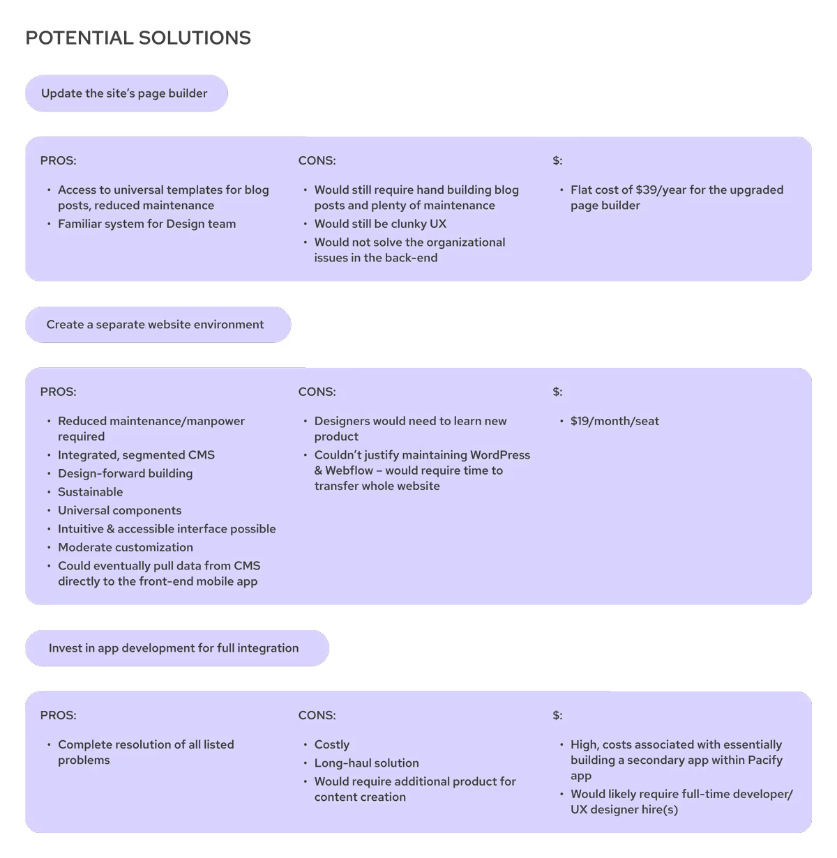
Identifying the nature of the Library's obstacles allowed me to recognize 3 core needs the solution had to fulfill:
1. strategy & workflow
- Clear documentation of content guidelines & strategy
- Structured workflow
- Taxonomy/architecture based on all audiences
2. optimized platform
- Design-forward
- Ability to be organized, segmented, displayed, etc. based on custom values
- Ability to integrate with mobile app
3. design system
- Standardization of content<>design application
- Mobile-friendly navigation
- UX/UI overhaul

the process
strategy & workflow
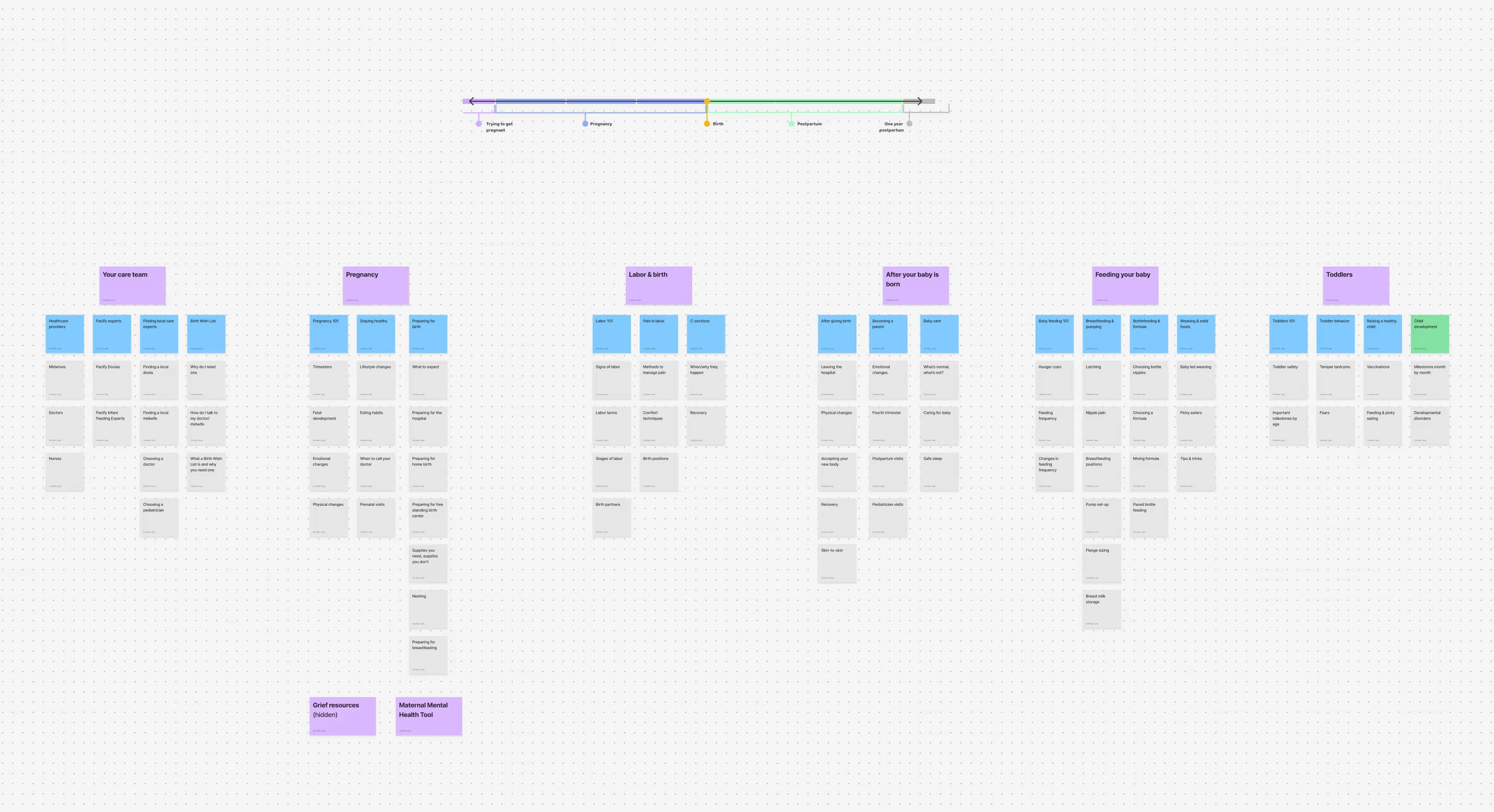
Strategy and workflow were tackled simultaneously. A key factor: Pacify users are at a specific, time-limited point in their lives, and pregnancy/parenting content needs are largely linear — the experience changes as time passes.
I worked with Clinical, Client Success, Marketing, and Leadership to understand Pacify's trajectory, then built a scalable architecture that mapped the user journey while aligning with the org's priorities.
With the framework in place, I built an Asana board with automations to move content through stakeholder review and into publishing as seamlessly as possible.

information architecture
Designing the user journey was key to an enjoyable, useful, responsive experience. This sitemap outlines the Library's core pages and the actions users take on each — helping users find content easily while driving the engagement Pacify needed.
I also designed it to empower Pacify's team as their content library grows — a framework built for expansion, customization, and efficiency on both sides.

building the CMS
Webflow gave us more control over how content data surfaced on Library pages. After studying Webflow's CMS documentation against our content strategy, I custom-built data fields beyond Webflow's default name and slug fields.
- Reference fields: In order to tie content to specific categories and subcategories, I built "Library Categories" and "Library Subcategories" as separate collections. This allowed us to tie "Library Posts" to a specific category and subcategory, and subsequently build this navigation into the Library interface.
- Image field: A featured image field to display on each article card was a must.
- Plain text fields: These limit character count and styling so collaborators can't accidentally break the layout — for example, article descriptions are capped at 75 characters.
- Rich text fields: These allow for more text customization and freedom to add images, videos, custom code, etc. to the Library Post itself.
- Toggle fields: These let the team conditionally display elements — like showing a video block only when an article includes one.

wireframes
I referenced other telehealth platforms and major periodical apps while wireframing, so users would feel at home in the interface.
Since users come to Pacify seeking guidance, I prioritized multiple ways to navigate the Library so they could find information quickly. Balancing user and stakeholder needs, I set the following objectives for the Library's structure:
- Provide multiple routes of navigation on each page and throughout content
- Use familiar components and layouts to reduce cognitive dissonance and improve navigation (i.e. search, filter, cards, tags)
- Avoid information overload in hopes of encouraging stickiness & utilization
- Tie content to vital KPIs within the core product
- Maintain a scalable structure to allow for sustainable growth over time

the product
protype & iteration
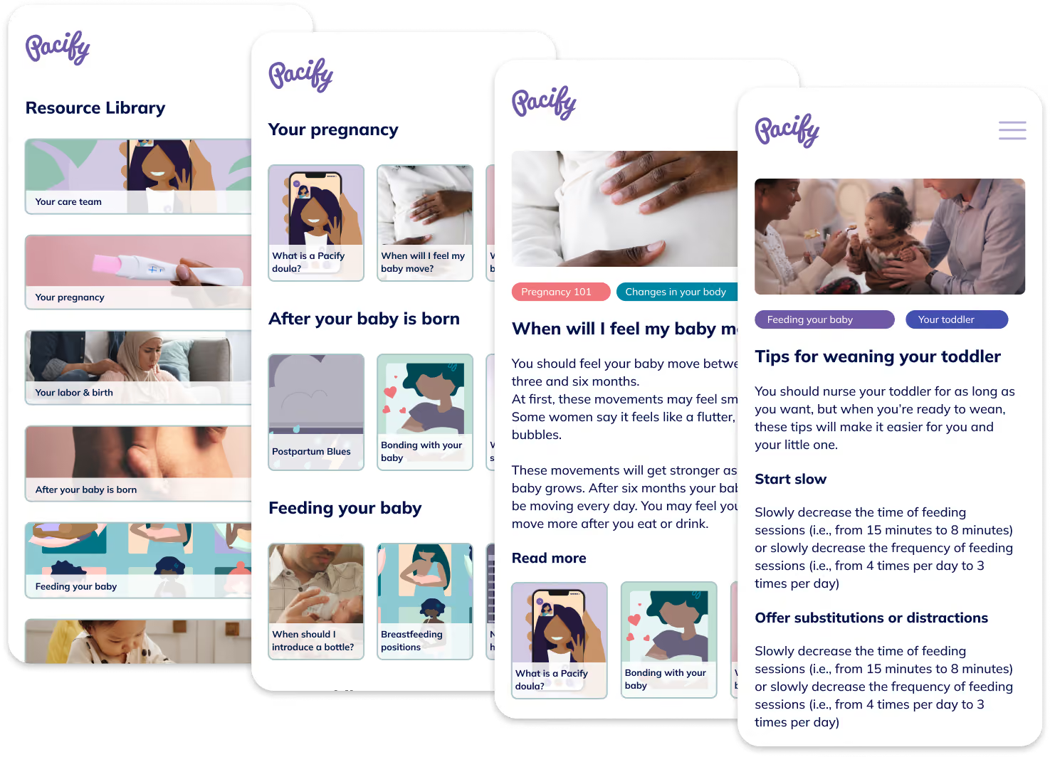
Applying the Pacify brand was a highlight of this project — it opened up creative avenues for color, typography, and layout.
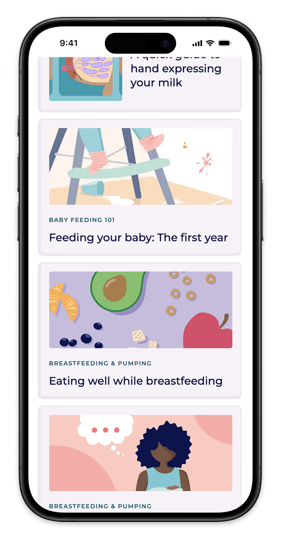
The first iterations took some trial and error to balance brand and information architecture. I made changes along the way to keep the interface clean — swapping color-coded tags for uniform ones, scaling elements up for mobile (where most users access the Library), and repositioning elements for clarity.


usability testing
I tested the first Library launch with real Pacify users to identify what revisions would make the experience more intuitive and enjoyable.


- Users were having trouble getting back to the Library after navigating into content.
Fix: Added Library navigation menu to footer and "Back to Library" button
- Users needed an easy way to jump to specific category from home page
Fix: Added category card buttons to landing page
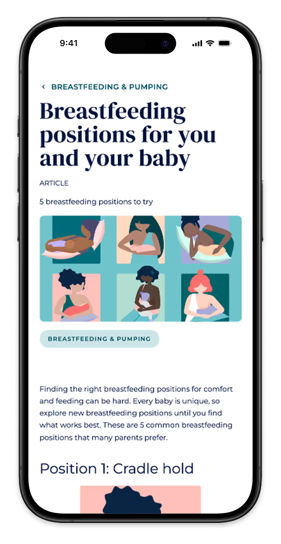
- Users became disoriented between Category and Article pages
Fix: Added content indicators to header sections to help identify content



conclusion
challenges
- Organizing a cross-functional workflow that allowed for stakeholder approval and team involvement
- Applying Pacify's colorful brand to a clean, intuitive interface without overpowering the user or creating visual clutter
- Anticipating user needs and interests with no historical user data
lessons learned
- Keeping things simple can make a huge impact in the overall outcome and usability
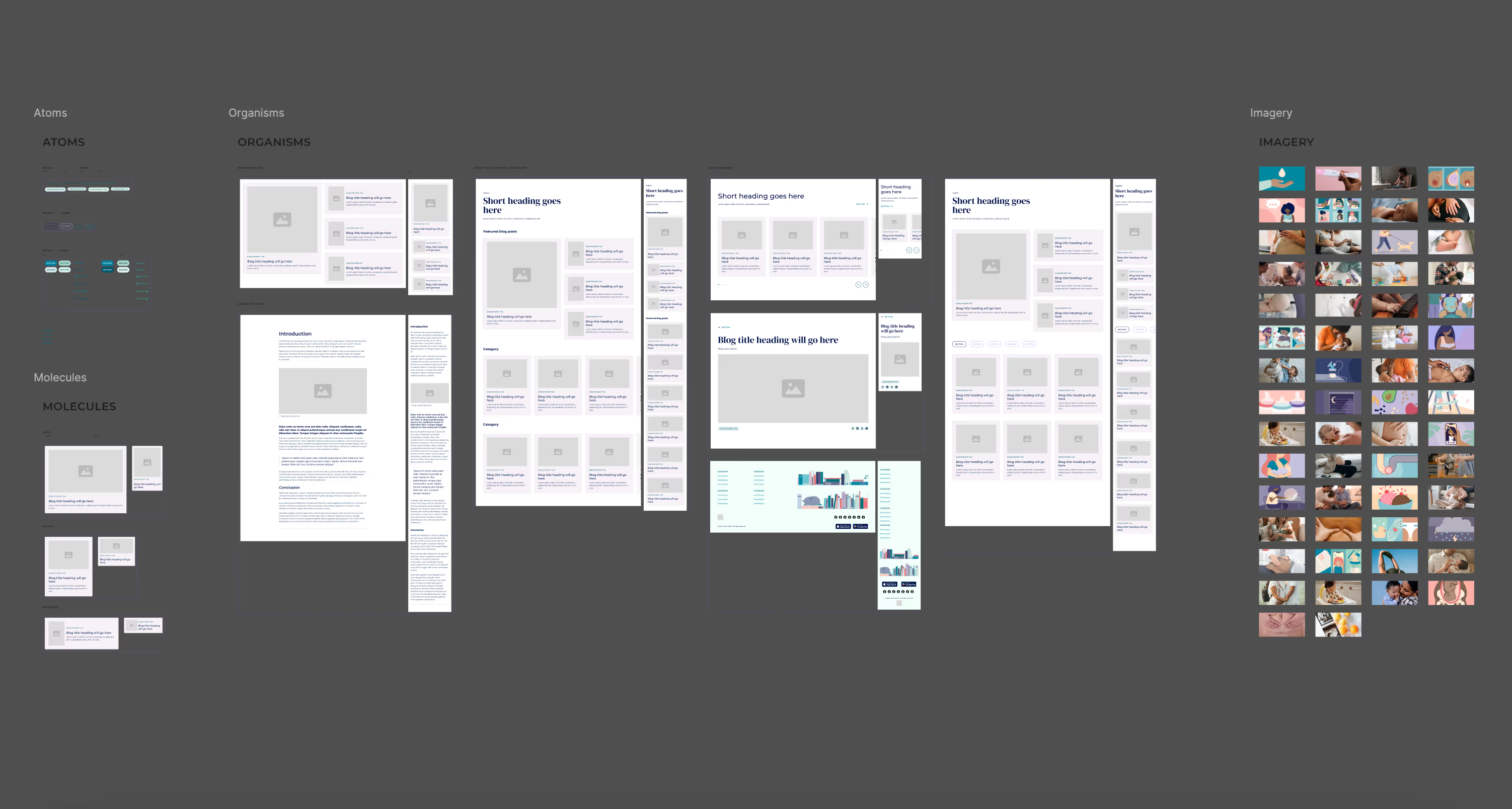
- The value of having an organized design system of atoms, molecules, and organisms to create beautiful and seamless experiences
- Collaboration is important!